

Designing an optimized landing page isn’t just a task — it’s an art form. If you want a landing page that doesn’t just exist but actively converts, you need to master the craft of conversion-centered design (CCD). Ready to level up?
CCD is the science of crafting experiences laser-focused on achieving a singular business goal. Think of it as your cheat code to guide visitors toward one specific action — whether that’s sharing their details, learning about your offering, or taking the next step in your conversion funnel. And at the heart of CCD? Landing pages.

Landing pages are your ultimate conversion tool, designed with a single purpose: to drive users toward a decisive action. They use congruent design — everything working in harmony to achieve a singular objective. But how do you nudge visitors toward the finish line?
The answer lies in leveraging psychological triggers and design elements that focus attention and encourage interaction. Let’s unpack the seven principles that make CCD tick.
Table of Contents
What is conversion-centered design?
When I think about design for conversion, I like to imagine it as a digital storefront. You know how a well-organized, eye-catching store draws you in and makes you want to buy something?
That’s exactly what CCD does — it’s all about creating web pages, emails, or landing pages that not only look great but are strategically designed to guide visitors toward taking a specific action. Whether it’s signing up for a newsletter, downloading an ebook, or making a purchase, CCD is the art of turning passive browsers into active participants.
At its core, CCD focuses on:
- Clarity
- Relevance
- Urgency
It’s not just about aesthetics; it’s about understanding your audience’s needs and removing any friction that might stand in their way. Think bold headlines, compelling calls-to-action (CTAs), and layouts that naturally lead the eye to the next step. Every element is intentional, from the colors to the copy, all working together to create a seamless user experience.
For me, the beauty of CCD lies in its balance — it’s both creative and analytical. It’s about designing with purpose, testing what works, and constantly optimizing to ensure your audience doesn’t just visit your page but takes the action you want them to. But, as they say, every house has its foundation, and CCD’s consists of seven key principles.
The 7 Principles of Conversion-Centered Design
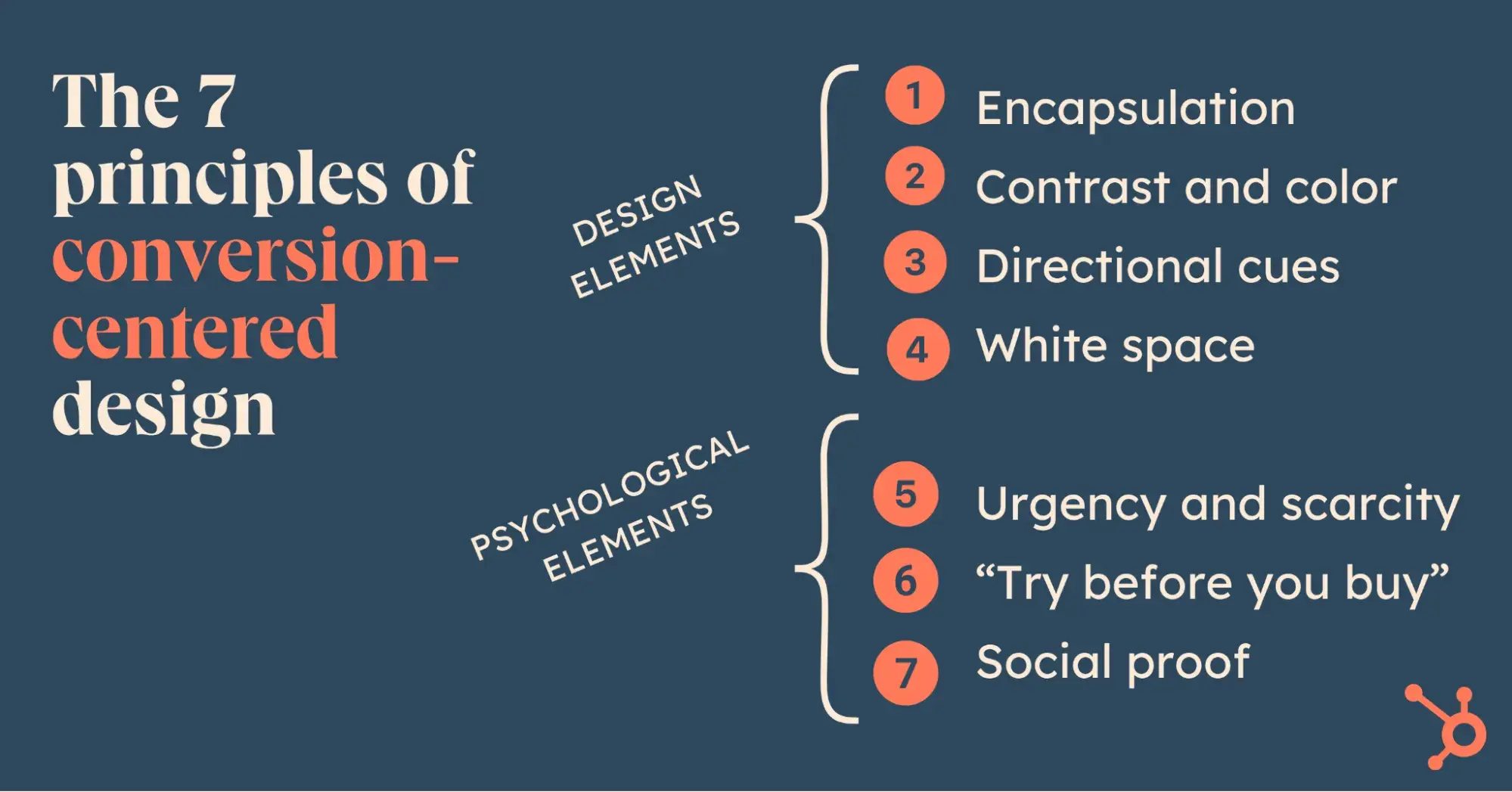

1. Encapsulation
This is a classic technique I like to use to guide your visitors’ attention and create a tunnel vision effect. I like to think of it as carving out a clear window on your landing page — where your call-to-action (CTA) is the view they can’t miss. It’s all about creating a focal point that instantly draws the eye and leaves no confusion about what to do next.
In my experience, it’s best to have one primary object as the star of the page — your main CTA — supported by secondary elements that complement it. If you overcrowd the page with too many competing words, images, or CTAs, it can feel like visual noise. Visitors get overwhelmed, unsure of where to look or what to do, and that’s when they’re likely to bounce. Keep it simple, focused, and intentional, and you’ll keep them engaged and moving toward that desired action.
Example of Encapsulation
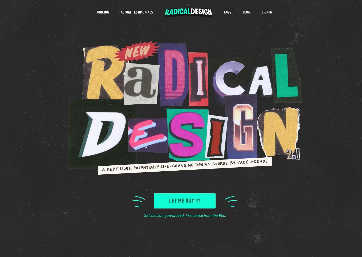
I think this landing page for Radical Design’s new design course is a great example of encapsulation. The dark background helps keep our eyes focused on the fun, colorful words and makes the bright CTA really pop. There’s nothing to distract us from the main message of the page.
Pro tip: Center your main message in the vision tunnel. This doesn’t necessarily have to be in the middle of the page (in fact, off-centered focal points create more dynamic pages), but you want to draw all your viewers’ eyes to the same point.
2. Contrast and Color
Contrast isn’t just a design principle — it’s a conversion weapon. Your CTA should scream “Click me!” even from across the room. Combining similar hues? Forget it. But a vibrant orange button on a monochromatic layout? That’s how you win eyeballs — and clicks.
The more you can make your CTA stand out from its surroundings, the easier it will be to see.
Color psychology matters, too!
Orange, for example, is known to generate positive feelings and can be a great choice for the color of your CTA. Each hue carries emotional weight, and understanding these associations can help you evoke specific feelings that support your goals.
- Red: Danger, stop, negative, excitement, hot.
- Dark Blue: Stable, calming, trustworthy, mature.
- Light Blue: Youthful, masculine, cool.
- Green: Growth, positive, organic, go, comforting.
- White: Pure, clean, honest.
- Black: Serious, heavy, death.
- Gray: Integrity, neutral, cool, mature.
- Brown: Wholesome, organic, unpretentious.
- Yellow: Emotional, positive, caution.
- Gold: Conservative, stable, elegant.
- Orange: Emotional, positive, organic.
- Purple: Youthful, contemporary, royal.
- Pink: Youthful, feminine, warm.
- Pastels: Youthful, soft, feminine, sensitive.
- Metallics: Elegant, lasting, wealthy.
Another important consideration is the contrasting effect of color. This idea borrows from white space and contrast techniques in that it’s a method of isolation via difference.
Example of Contrast and Color
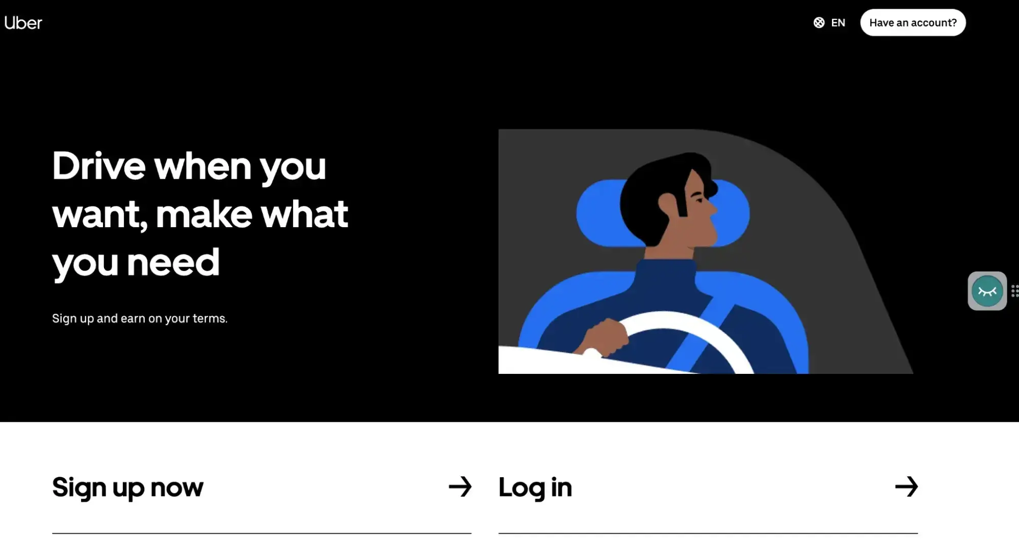
This has always been one of my favorite landing pages because of how barebones it is. White text on a black background, light blue on grey, white on dark blue, done. No nonsense, animations or beating around the bush.
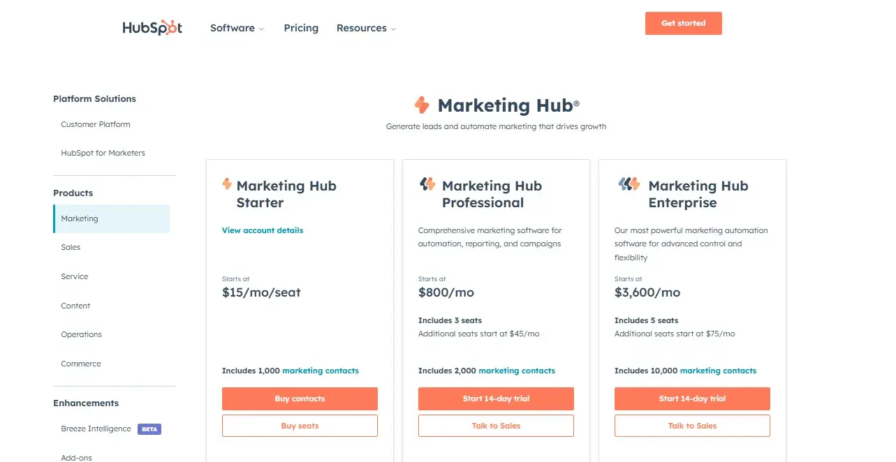
Ah, the old reliable. Orange is a very tricky color to include “tastefully,” but HubSpot gets it done with a simple white background. You’ll notice how there is enough content to make the white not too bright.
Pro tip: Want an edge? Leverage contrast to make your button pop. If your page is cool-toned, a fiery red or orange button will dominate attention. Pair colors strategically to avoid visual clashes while ensuring maximum impact.
3. Directional Cues
Humans are wired to follow directions — literally. Whether it’s arrows, pathways, or even the gaze of a photographed subject, directional cues are visual road signs guiding users straight to your CTA.
These cues capitalize on our natural tendencies to seek guidance, making them invaluable when it comes to design for conversion.
Arrows
As directional cues, arrows are about as subtle as a punch in the face, which is why they work so well. With so little time on your page, visually guiding the user to the intended focal point is a smart move.
Arrows let you say, “Ignore everything else, and pay attention to this please.”
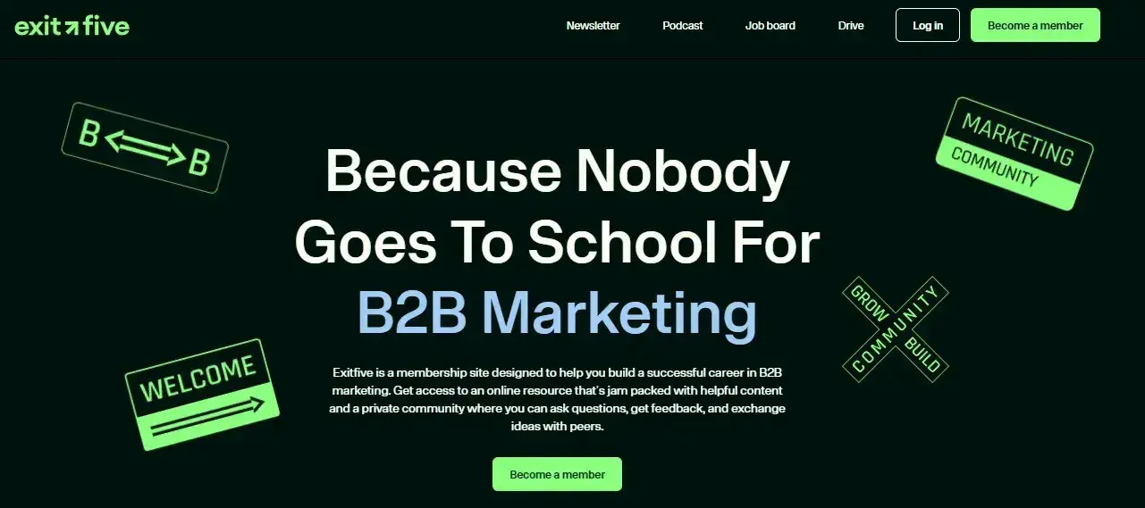
The awesome example below shows four different cues at once. One arrow is more aggressive, while another goes in both directions. There’s also two signs pointing in the direction of the header, subtly leading people towards key features. I love it because it’s so free-flowing and direct at the same time.
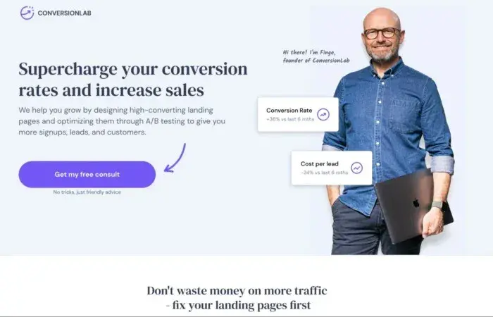
Now, let’s take a look at something more immediate and direct. The second example shows a man holding a Macbook, representing a satisfied user of Conversion Lab. I like how there aren’t too many bells and whistles, just a purple hand-drawn arrow pointing at the equally purple button. Less is more, folks!
Pro tip: For maximum effectiveness, I suggest you design converging lines to draw people to your CTA. Triangles are the most dynamic of all shapes, and their natural tendency to point makes them a special design tool, in the same way that an arrow is a more intricately designed pathway.
Pathways
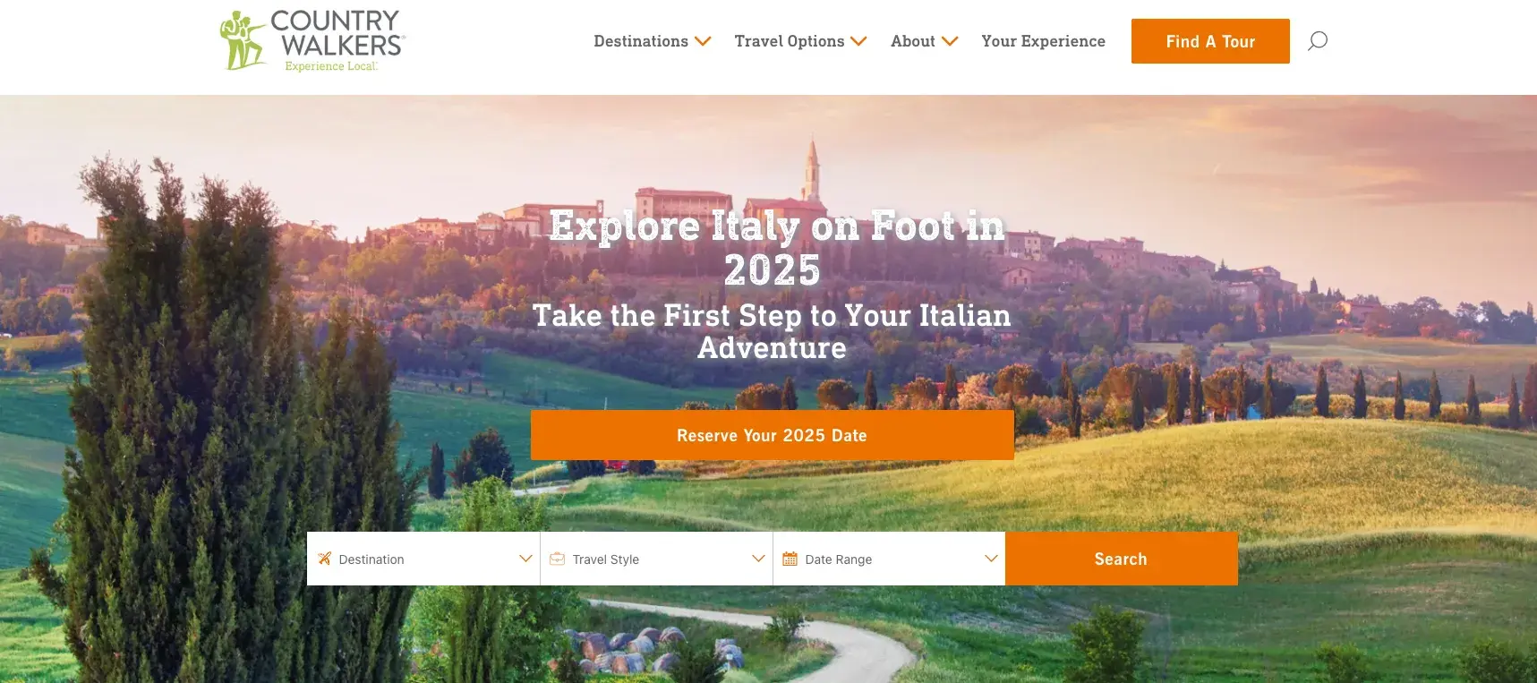
Another great design element here are pathways. Pathways represent real-world way-finding avenues that trigger our brains into thinking we need to follow them. Roads are so strongly ingrained in our psyche as the path of least resistance, that we naturally gravitate toward them as a transport guide.
This example shows a windy, inviting road, leading to some fabulous… well, Italian adventure… as described by this tour company. Notice how the CTA is placed so that your eye follows the path straight to it?
Suggestive Power of the Eye
As humans, we’re all programmed to understand the purpose and use of eyes and the meaning that comes from the eyes of someone or something else. Who are they looking at? What is the gaze like? What emotion can we read from it?
In the first example below, the woman is looking at the screen, which is coincidentally in the same direction as the button to start a Pro trial for free. Her face also has an expression of excitement, which immediately made me want to know what all the fuss was about. Curiosity is the motivation that forces you to follow his gaze.
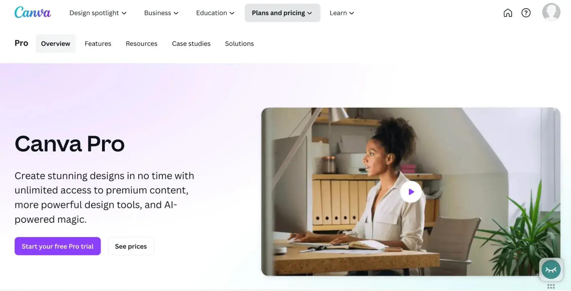
You’d want your conversion target to be where she, and everyone else, is looking.
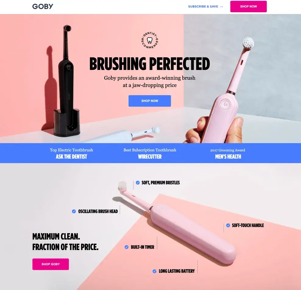
In the second example below, the directional cue is more subtle but still very clear. Your attention is first driven to the top right brush, which is pointing almost exactly at the Shop Now button.
The one below is also prominent, pointing to the Shop Now button in the middle of the landing page, which is also, incidentally, a different color compared to the one I first pointed out. Finally, to complete the triangular shape around the main conversion button, the third brush is a high-contrast position, pointing directly towards the Goby logo. Now that’s what I call harmony.
4. White Space
White space is a design element that often goes unnoticed — yet it’s one of the most powerful tools for creating emphasis. This empty area surrounding key elements clears clutter, enhances focus, and brings clarity. It’s the visual equivalent of a pause that lets your CTA sink in.
I like to think of white space as the quiet that makes the message louder. It’s not just a stylistic choice — it’s a strategic one.
Example of White Space
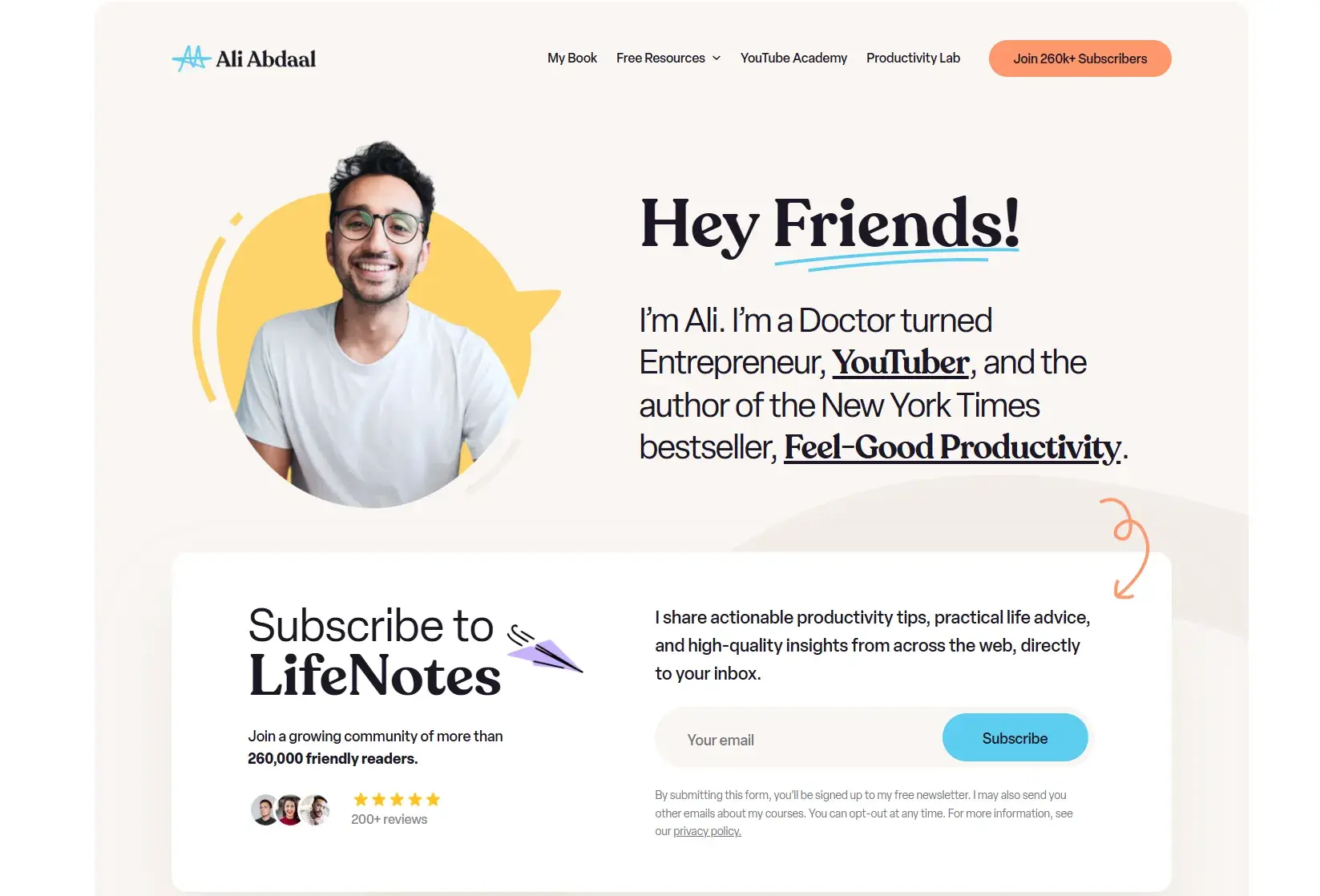
Ali Abdaal keeps it simple but still manages to deliver a stunning, complex page. How exactly? Pay attention to the different shades of white and grey. My eyes didn’t register them as colors designed to fill the space, instead perceiving them as regular emptiness. But when you look closer, everything is cohesive and the directional cues are all there.
Pro tip: White space gives your elements room to breathe. Reducing clutter, you amplify the impact of focal points, such as your CTA. The interplay between blank space and design elements creates a calming yet engaging aesthetic that keeps users focused and attentive.
5. Urgency and Scarcity
Now we’re moving from design principles to psychological elements that help create high-converting landing pages.
Two of the most common psychological motivators are the use of urgency (limited time) and scarcity (limited supply). They’re simple concepts that can be applied in a number of ways.
Example of Urgency
“Buy now.” “Don’t miss out.” We’re used to hearing these types of phrases. Statements of urgency are used to coerce us into making a purchasing decision right away. But how do you use them effectively?
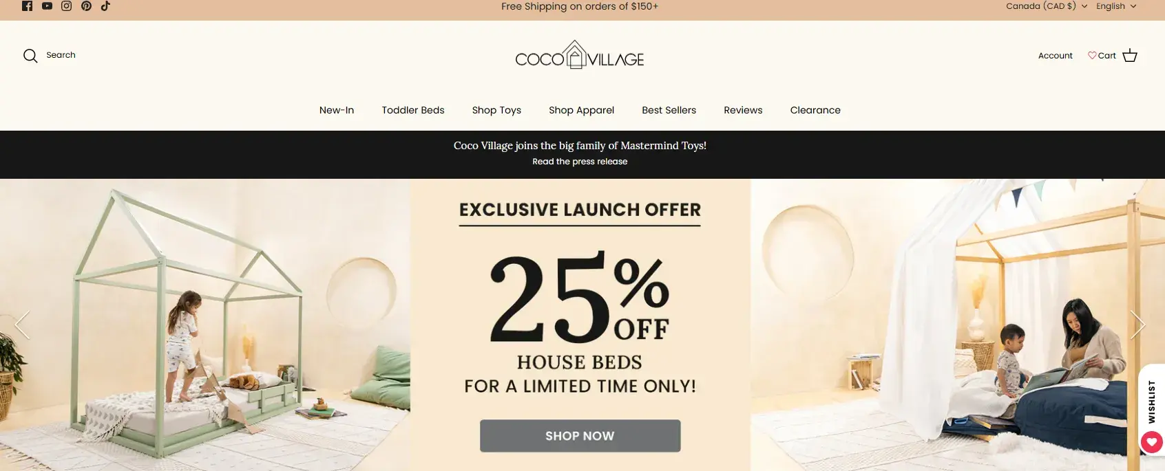
This is how. Coco Village manages to create a sense of urgency without additional pressure using three different elements. When I opened the page, my eyes were immediately focused on the 25%, followed by the words “exclusive” and “limited time only.” The subtle reminder doesn’t rush potential leads, but still manages to hasten the decision making.
Example of Scarcity
As humans, we naturally feel anxiety and a feeling to rush when something is running out. We want to snatch it ASAP without considering too many additional factors. That’s why there’s a limited time to make use of this feeling of urgency.
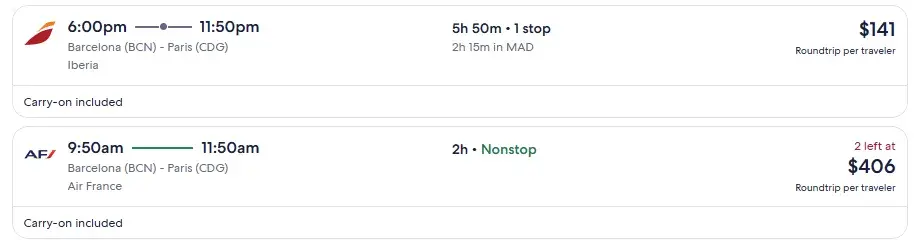
Airline ticket purchasing is very sensitive to the concept of scarcity, as the number of seats rapidly diminishes as the flight time nears. To leverage this, Expedia uses transparency as a psychological trigger to encourage you to get your credit card out and book right away.
They do this by showing the number of seats left on the flight, but only when the number is low, like only three seats left, as shown in this example:
6. “Try Before You Buy”
Let’s be honest: Who hasn’t swiped a grape or two at the supermarket just to make sure they’re worth buying? It’s like a universally accepted little act of thievery that we all justify in our heads. Some feel guilty, others don’t, but we all know the drill.
As a marketer, you can take inspiration from this. Let your audience “taste” your product without hesitation or fear of commitment. A little free sample goes a long way in building trust and curiosity.
Example of Previews
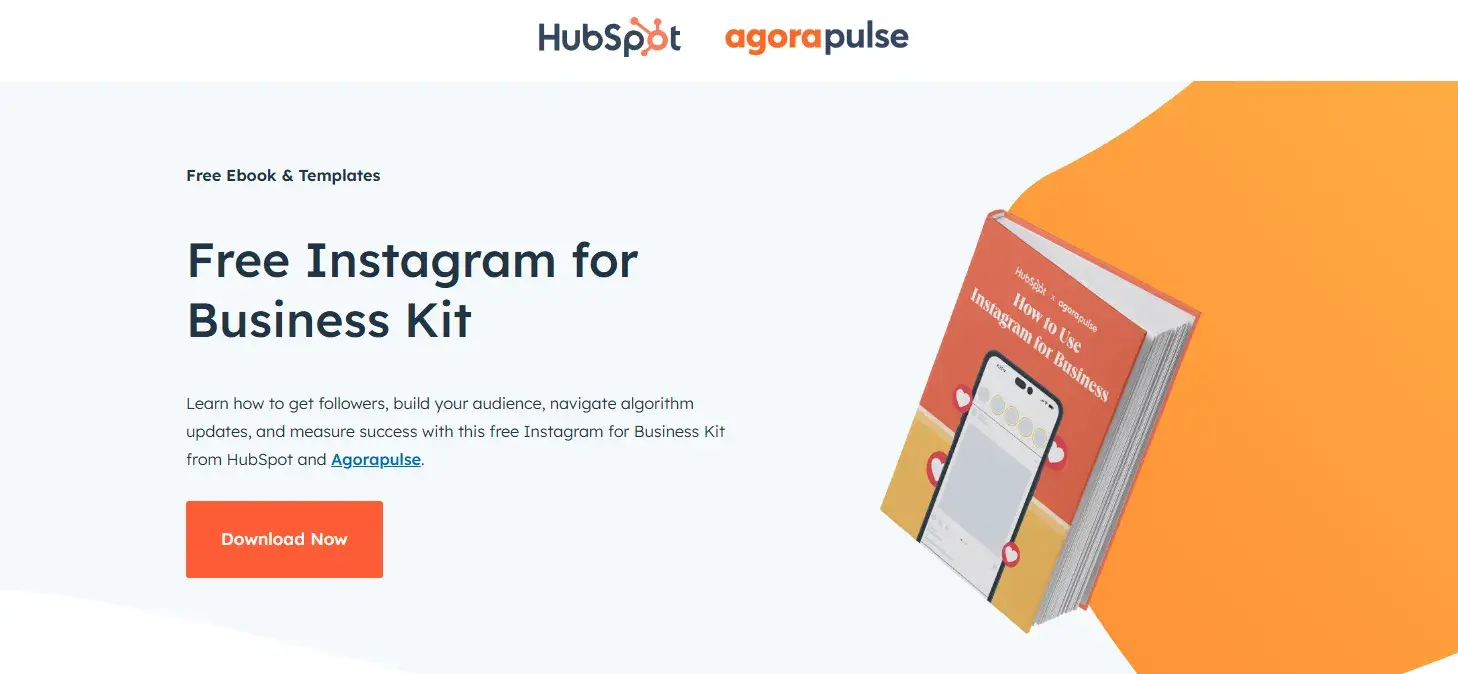
People love a sneak peek before committing. If you’re offering an ebook, why not give away the first chapter as a free download? Or, take a snippet and turn it into a blog post with a CTA that says, “Download the full ebook.”
Not everyone will bite, and that’s okay — you’re weeding out the tire-kickers and focusing on quality leads instead of piling up hundreds of contacts who’ll never convert. It’s all about working smarter, not harder.
Amazon is a classic example of this principle with its “Look Inside” feature, which lets you read a portion of the book in advance.
Pro tip: Letting people check out your product before committing shows confidence. It’s like saying, “We have nothing to hide” — and that builds credibility. People are way more likely to buy when they trust what they’re getting. Transparency isn’t just a nice-to-have; it’s a game-changer for conversions.
7. Social Proof
Social proof works because humans are wired to trust the actions of a crowd. If everyone’s doing it, it must be good, right? It’s the “me too” factor in action and it brings instant believability.
You can create this same effect online. Show off your social proof: the number of shares, downloads, or sign-ups. People love seeing numbers that say, “Hey, everyone else is doing this” — it’s a great way to grab attention. Testimonials are another goldmine, especially when they’re from familiar names or industries your audience trusts.
Example of Social Proof
Sometimes, I get caught up in all the UI elements that need to be on a landing page that I forget how irrelevant they are compared to word of mouth. If there are real people advocating for the product, then the trust level rises significantly.

Pro tip: Testimonials can hinder conversion rates if used incorrectly. Discover some top tips for leveraging customer testimonials.
Design for Conversion
Through writing this piece, I remembered the power of conversion-centered design and how psychological principles influence user behavior. Breaking down the seven key principles reinforced how strategic design elements — like contrast, directional cues, and urgency — can significantly impact engagement and conversions.
More than just aesthetics, CCD is about guiding users with intention, making every design choice purposeful. The process also highlighted the balance between creativity and data-driven optimization, reinforcing the idea that effective landing pages blend both art and science to drive results.
Editor’s note: This post was originally published in June 2013 and has been updated for comprehensiveness.